Big Local Works- Redesigning Big Local Works website to make it more usable for Dyslexic users
Role
UI/UX designer
Duration
May - September 2025
What is Big Local Works?
Big Local Works is a Community-based organisation in Bermondsey, London. It’s a legacy project established in 2017 to improve the lives of local people.
1
Offers welfare benefits support
2
Provide Local Employment support
3
Manage The Blue Market and support local businesses
4
Offer workspace on rental
Why Dyslexia? What is Dyslexia?
Affects around 10% of UK population
Dyslexia is not related to Intelligence
Dyslexia is a common learning difference that primarily affects skills involved in reading, writing, and spelling.
How to achieve this?
How might we
How can the Big Local Work’s website be redesigned to improve usability for dyslexic users?
Phase 1
Phase 2
Phase 3
Why Scenario-Based Tasks?
By placing participants in relatable situations, the scenarios help them engage more naturally with the content, making their behavior and feedback more authentic and insightful (McCloskey, M. 2014).
Eye tracking testing
5 dyslexic Participants, 10 neurotypical Participants
Survey and Interview
WCAG Coga Guidelines
Dyslexia style guide by BDA
(British Dyslexia Association)
Eye tracking testing
5 dyslexic Participants, 10 neurotypical Participants
Survey and Interview
Designing Usability Testing
The biggest challenge was to find Dyslexic participants
Tasks for usability test were designed considering the purposes of the Big Local Work’s BLW website.
Convey what is BLW and its purpose.
Showcase the services offered and contact BLW to use them
Impact of BLW’s work
Based on these purposes, 7 Scenario-Based tasks are designed for testing.
SCENARIO
You are looking for a new job and need mentoring in job search and interview preparation.
TASK
Try to find more information about employment support and find a way to contact BLW with your requirement.
Once you have finished, please tell the researcher.

This Task card will be given to participant.
The Dyslexia Association of London
Dyslexia Association of London’s Adult dyslexia group helped me by participating in my study
Findings of Usability Testing with
5 dyslexic participants
Age group : 26 to 40 | Location : London, UK
Findings of Usability Testing with 10 neurotypical participants
Age group : 22 to 45 | Location : London, UK
Findings of Usability Testing with 10 neurotypical participants
Age group : 22 to 45 | Location : London, UK
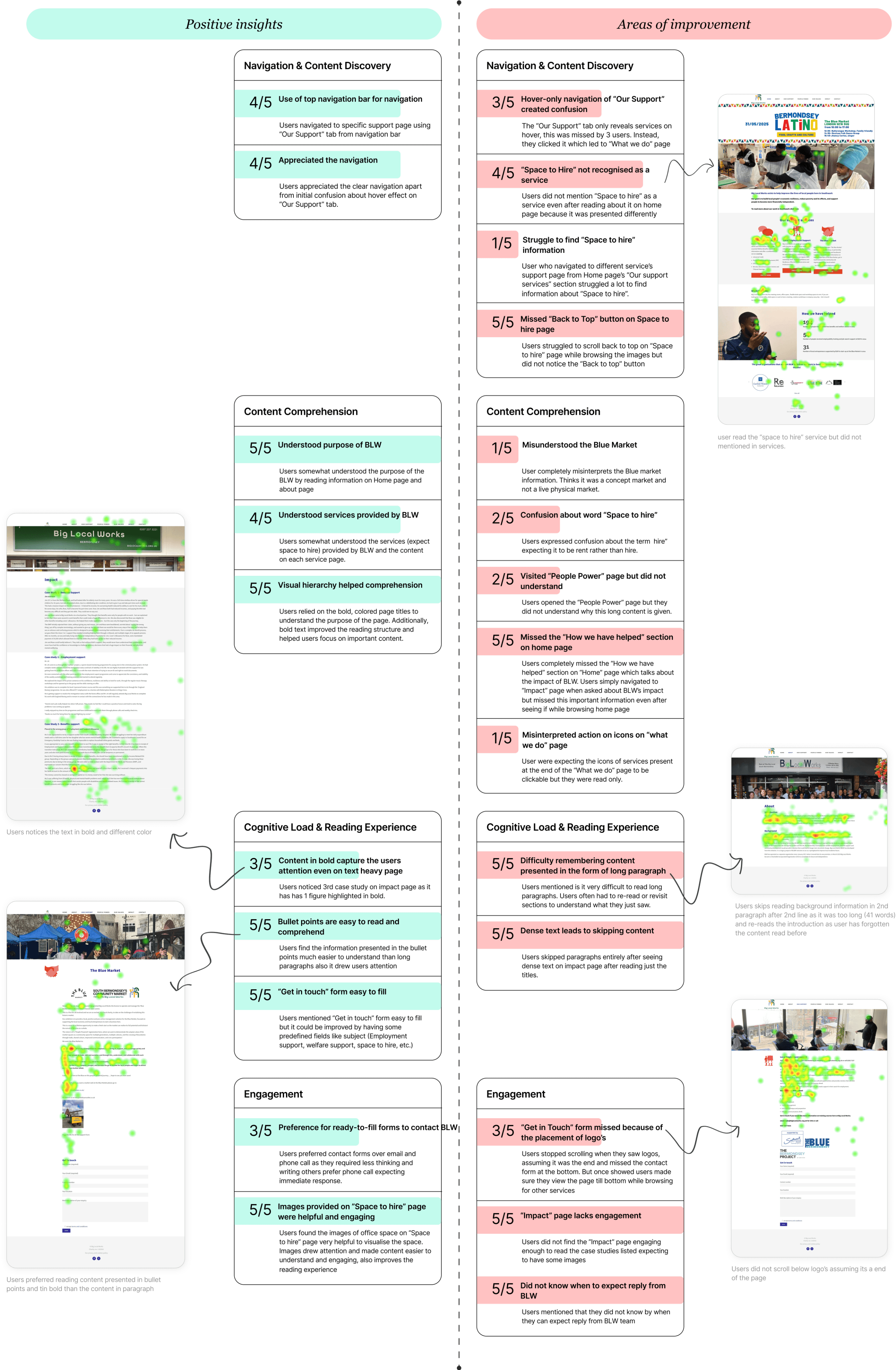
3 users suggested testimonials or pictures would be more engaging than full case studies on impact page also the “How we have helped” section on our impact page would add more value.
Term “space to hire” is confusing, users suggest to use word “rent” rather than hire.
Forms are overlooked if not properly styled or separated visually from surrounding content.
None used the “Back to Top” button, suggesting it is not visible.
Users expect more structured and well labeled content.
Hover navigation of “Our Support” is confusing.
Users get confused with repetitive and inconsistent wording of contact information on services page.
Why not Dyslexia specific font?
Phase 2- Prototype Development
While redesigning the website I have used WCAG Coga Guidelines and British Dyslexia Association’s Dyslexia Style Guide published in 2023 to address the problems identified in phase 1 usability tesing.
Fonts that were specially designed for dyslexia did not lead to better readability. On the contrary, it pointed slightly longer reading time and less preferred by participants compared to sans serif. (Yoliando F., 2020)
WCAG Coga Guidelines
Help users understand what things are and how to use them
Help Users Find What They Need
Use clear and understandable content
Help Users Avoid Mistakes and Know How to Correct Them
Provide Help and Support
BDA Dyslexia Style Guide
Font: Open Sans. Size- 16-19px
Line spacing: 1.5 or 150%
Text emphasis: Use bold text not Italics
Colours and backgrounds: avoiding stark white backgrounds, use cream colors
Content presentation: concise writing, bullet points and images to support text.
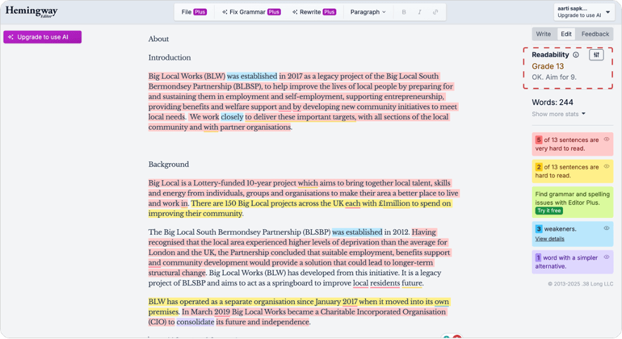
Hemingway Editor
Tool to improve the readability of content
Redesign- Navigation Bar
It gives a level of readability, flags sentences that are "hard" or "very hard" to read, and warns about overly difficult vocabulary.
Also rewrites the content to improve the readability
Number of tabs was reduced to create a cleaner and more focused layout.
A clear and prominent Contact Us call-to-action (CTA) was added.
Arrow icon was introduced to the “Our Support” tab .
Content was also reorganized in different tabs.
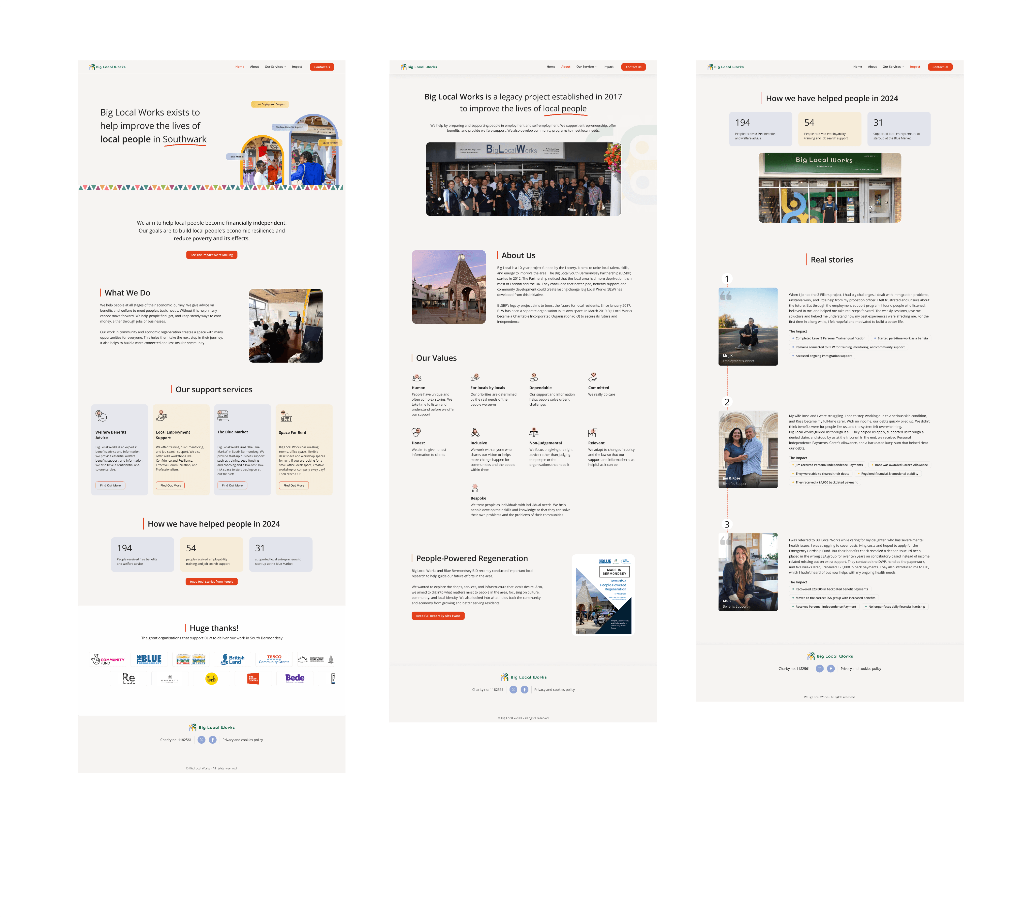
High Fidelity Wireframes
Home Page
About Page
Impact Page

Existing Navigation Bar
Redesigned Navigation Bar
Users did not understood what people power tab is about
Users got confused with Our support hover action

Big Local Works
Home
About
Our Support
Impact
Contact Us
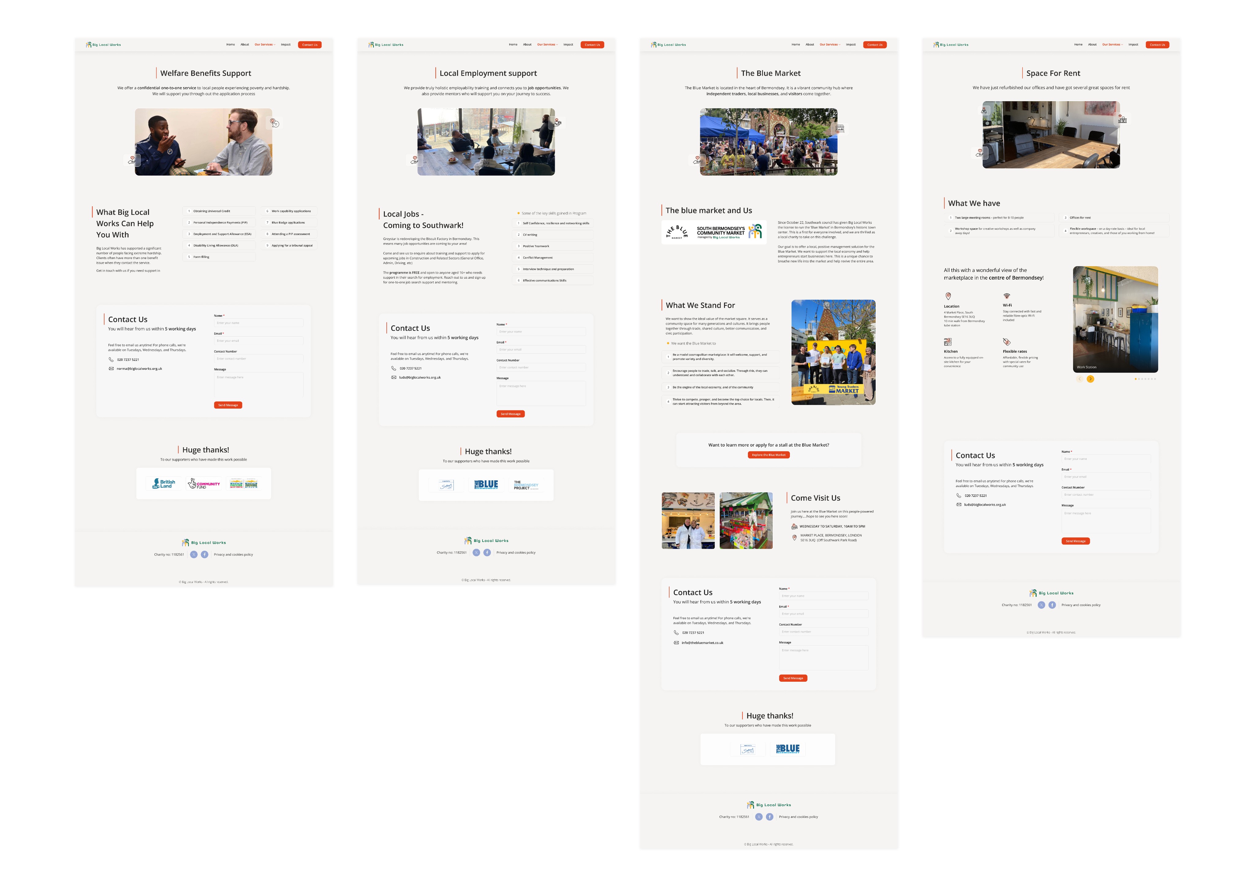
Welfare Benefits Support
Local Employment Support
The blue Market
Space for Rent
Findings from Phase 3 usability testing
Survey Analysis
Fixation Duration as a Measure of Readability
•No confusion with "Our Support" tab; all services correctly identified.
•Bullet points and clear titles significantly improved readability.
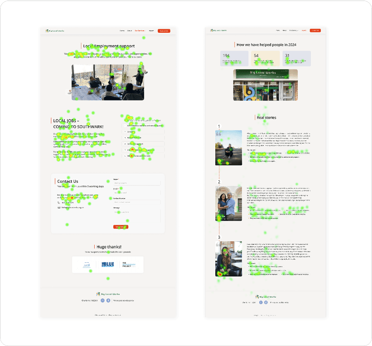
•Participants focused on bullet points of Impact page.
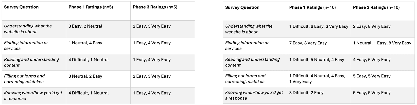
All participants shifted from difficult/neutral to easy/very easy. The results show that the redesign successfully reduced barriers.
Fixation Duration denotes how long the eye rest still on a single place. Shorter Fixation duration means better readability.
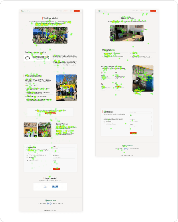
The heatmap on the left shows a dyslexic participant (ND2) reading all the information on the Local Employment page. The heatmap on the right shows the same participant focusing mainly on the impact bullet points, images, and names of people.
Survey results of dyslexic participants
Survey results of neurotypical participants
The heatmap on the left shows a dyslexic participant (ND5) focusing on bullet points and images. The heatmap on the right shows another dyslexic participant (ND2) reading all the information on the Space for Rent page and viewing all images
•"Space for Rent" and Blue Market clearly understood with visuals.
•2 out of 10 neurotypical participants felt that contact information being present on every page was too much. By contrast, dyslexic participants valued this consistency, describing it as reassuring and convenient.
In Phase 1, dyslexic participants had an average fixation time of 0.29 seconds.
After the redesign, in Phase 3, fixation duration improved to 0.20 seconds, showing improved readability.
Conclusion 💭
Together with phase 3 insights, survey results and improved fixation duration, it is visible that the redesigned BLW website significantly improved usability and readability for dyslexic users, while also creating a better experience for all.